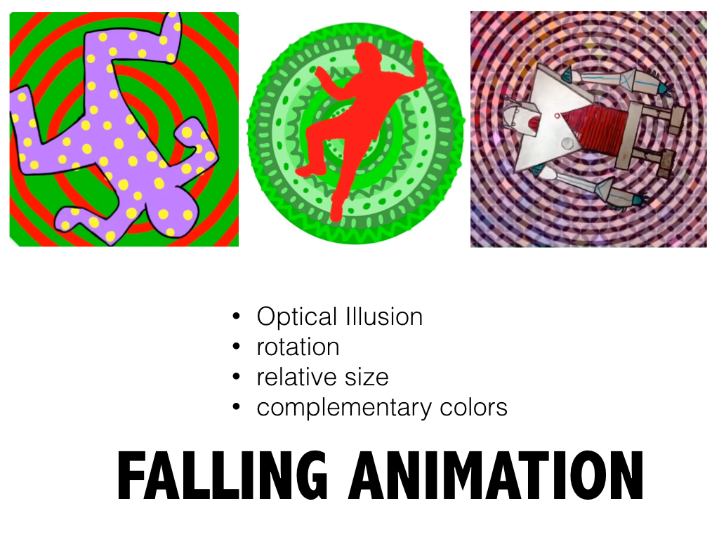
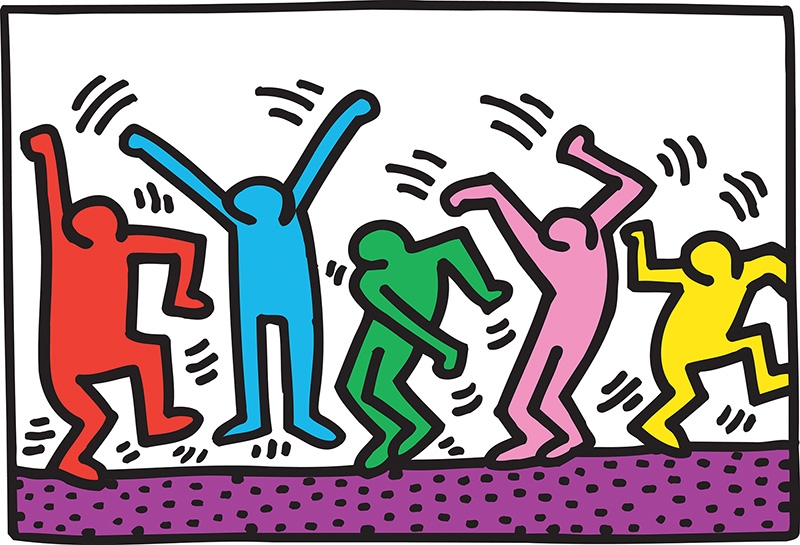
 Image by Keith Haring | I have been playing with ideas for making animations that teach multiple art concepts to students. This idea covers: Figure drawing in the style of Keith Haring Complementary Colors Line & Shape pattern Relative size to show Depth Animation in layers Rotation for optical illusion |
The animation begins by drawing to objects in the DoInk Animation App.
Both objects need to be a complementary color pairs (red/green), (purple/yellow), (orange/blue)
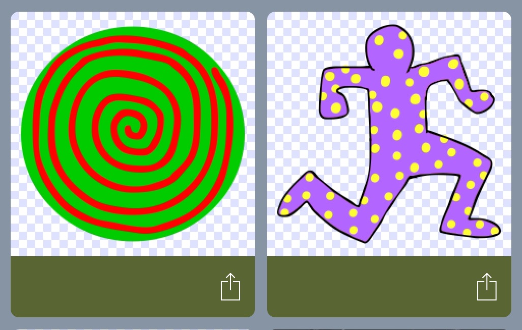
1. The first object is a circle with lines that converge at the center. I used a spiral, but the lines could also radiate out/in with straight, jagged, curving, bumpy, (whatever) lines.
2. The second object is a figure drawing in the style of Keith Haring. This figure is a solid color with a shape pattern in the complement. I used circles but you can use squares, diamonds, hearts, ovals, flowers, leaves, (whatever) shapes.
Both objects need to be a complementary color pairs (red/green), (purple/yellow), (orange/blue)
1. The first object is a circle with lines that converge at the center. I used a spiral, but the lines could also radiate out/in with straight, jagged, curving, bumpy, (whatever) lines.
2. The second object is a figure drawing in the style of Keith Haring. This figure is a solid color with a shape pattern in the complement. I used circles but you can use squares, diamonds, hearts, ovals, flowers, leaves, (whatever) shapes.
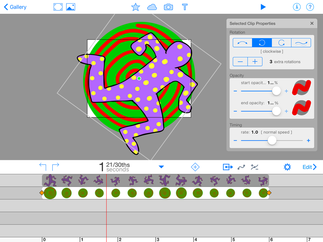
The two objects are then layered in the composition mode of the DoInk app. I stretched them both out to 6 seconds and set opposite direction rotations on each.
Then I altered the size of the figure so that it began full size and ended almost so tiny that it disappeared.
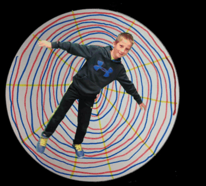
The lesson is designed to help students see that complementary colors are extra vibrant in your eyes. The rotation of the lines as they converge into the center create an optical illusion that adds depth to the image. The shrinking of the figure creates the illusion of depth as if he/she is falling. Below is video:
Then I altered the size of the figure so that it began full size and ended almost so tiny that it disappeared.
The lesson is designed to help students see that complementary colors are extra vibrant in your eyes. The rotation of the lines as they converge into the center create an optical illusion that adds depth to the image. The shrinking of the figure creates the illusion of depth as if he/she is falling. Below is video:
Variation of the idea:
This was my first attempt at this animation idea. In this animation I used the Kaleido Free app to draw lines converging to the center. The app allows you to save your drawing as a movie. To layer the figure and the movie I used the Green Screen App by DoInk.
| Here is another Keith Haring iPad art idea I had using the Wooden Doll app on the iPad. Check it out here. Also, you're going to want to show this Fugleflick to your students to introduce Complementary Colors: | 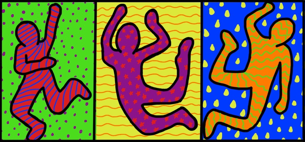 |
Hypno Bot (another variation)
Pretty much anything can fall, rotate, and shrink away. Here is a 5th grader's robot falling over two layers of images. One layer is a semi-transparent rotating spiral and the other is a geometric patterned design.
The Quick Version:
Since you can animate photos using the DoInk Animation App, I think this variation on the idea may be the fastest one. Students will pose as if they are falling (in front of green screen). Then they will draw an optical illusion circle (like a spiral design). This will be photographed also.
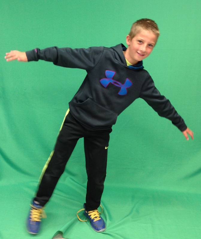 Student poses in front of green screen | 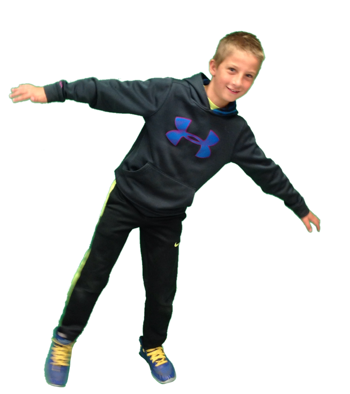 PNG with transparent background | 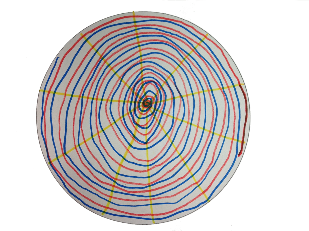 photo of student art with transparent background |
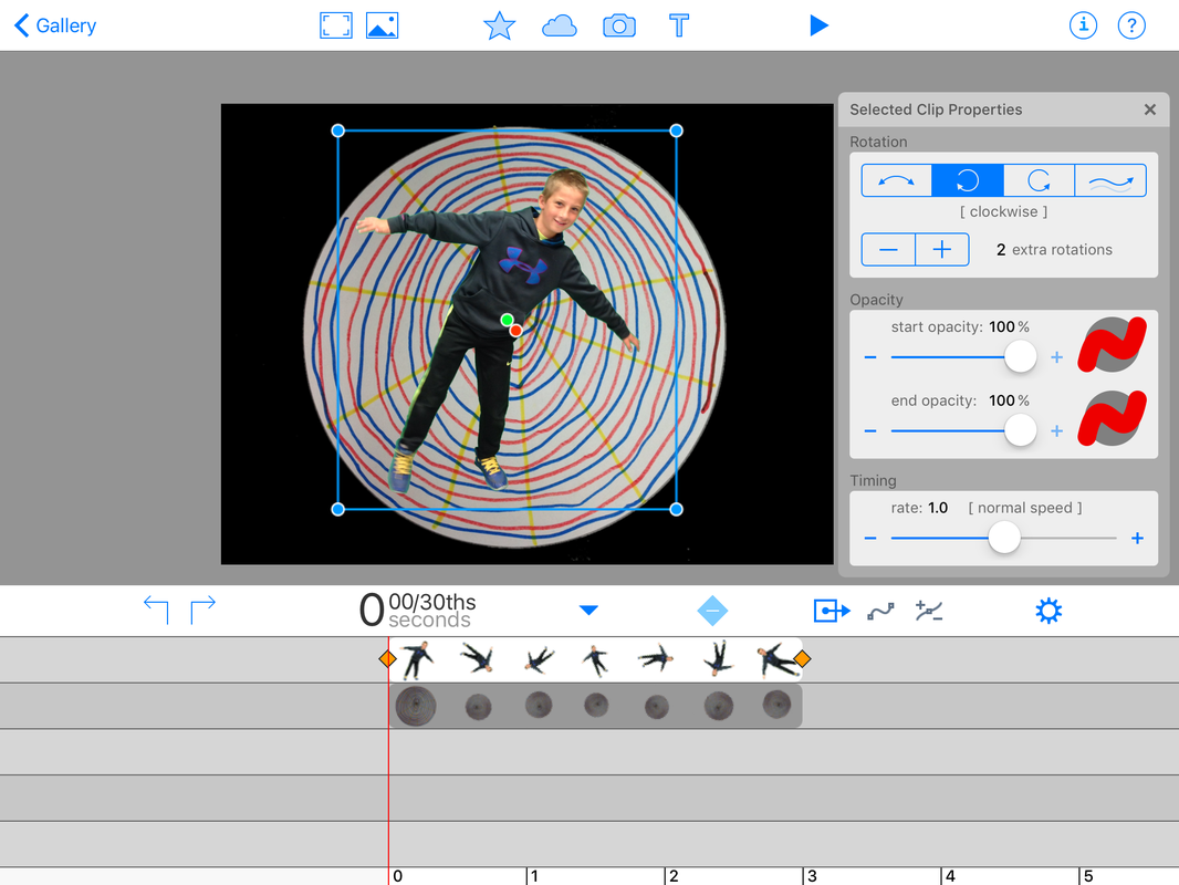
Set the animation to 3 seconds, set 2 rotations to each layer in different directions
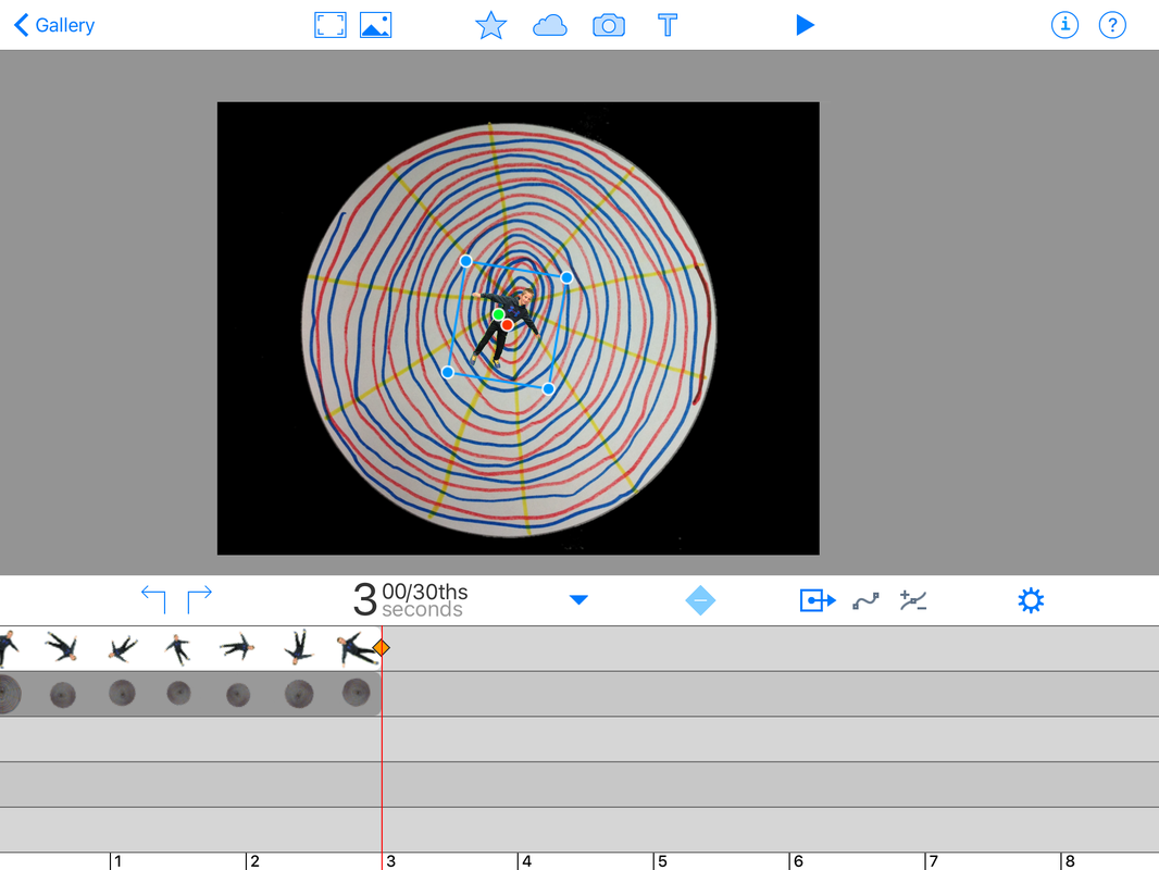
Scoot the timeline to the end of the falling image and resize it to make is very small
GIF made from animation video using ezgif.com
Finished Videos:
Falling Animation 3-1 from Tricia Fuglestad on Vimeo.
Falling Animation 3-2 from Tricia Fuglestad on Vimeo.
Falling Animation 3-3 from Tricia Fuglestad on Vimeo.
3-4 falling animation from Tricia Fuglestad on Vimeo.
Resources:

Students used these color examples as a reference for their op art design
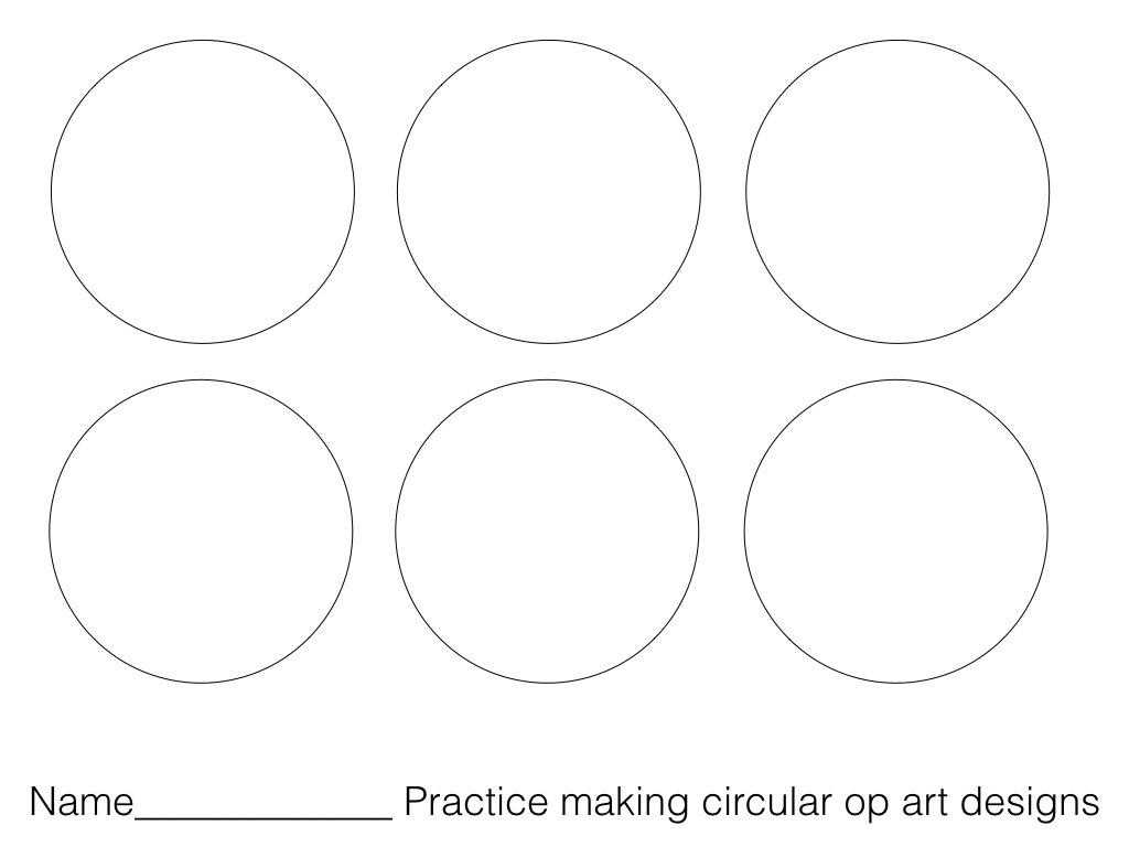
On this practice sheet students tried to recreate the designs above
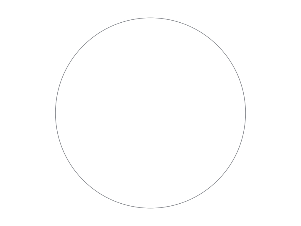
Students made their final design in this circle while leaving the background clean


 RSS Feed


